
Bucking the trend of rock & metal releases that I normally showcase here, I decided to go with a fantastic little rap ditty from Game.
The Documentary is Game’s (formerly The Game) first major-label album and was released on Dr. Dre’s Aftermath Entertainment, which is a subsidiary of Universal. Game is from Compton, California and this album has that fantastic West Coast vibe all over it. It just reaks of sunny days and drive-by shootings. Dr. Dre helped produce the album and other notable rappers such as 50 Cent, Eminem and Busta Rhymes are featured on the album.
This album was probably the one I enjoyed LEAST of his earlier catalog until I finally gave it another try and it finally clicked with me. Maybe it was the fact that I tried to like it many times before and it finally stuck, maybe it helped that it was summer time and I was feeling good that day… I don’t know what happened but I finally gave in to the power of this record and now haven’t looked back. This album also has what I felt, at the time, to be a lot of guest rappers. When the album did finally settle in with me I realized I was most likely hating on it because I just do not like 50 Cent’s rapping and sadly his stink is all over this record. Maybe finally getting over that and accepting his presence led me to accepting and loving this album.
What I really like about this album is that, to me, it is an extension of the 90’s West Coast gangsta rap It’s heavily influenced by the members of NWA, Ice T, Snoop Dogg and all those other great rappers of the time. The whole thing just sounds like a good California day. I LOVE the 90’s West Coast gangsta rap. Other than old-school NY hip-hop, this is the only style of rap I like. I find it to be the heaviest and just down-right angry rap that perfectly parallels my love for metal music. It also tells stories. Game’s early music, as well as all those old 90’s rappers were still concerned with telling a story. It wasn’t all about the beat. It wasn’t all about getting people to shake their ass. It told stories of the ghetto life and the struggles that it entails. The album fits right in with any of those classics of the 90’s. It sounds like that period of time without seeming dated or like it’s trying too hard. Actually, Game’s first 3 major-label albums all have that feel. It’s fantastic stuff and I recommend anyone who hates on him to give them another shot.
Getting into The Documentary‘s design was easy. I always enjoyed the imagery that Game had and the simplicity of this cover is no different.


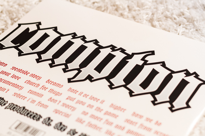
An all-white cover featuring Game sitting on some rims/tires with just his logo and the album title in the background. Yes, please! Powerful stuff. Just having him sit there and mean-mug the camera was a great decision. It sets a tone for the record and it matches the songs completely. The choice of red for the logo and other typographical elements is most likely a reference to the Bloods street gang that he is known to be affiliated with. I honestly can’t imagine it being for any other reason. Sure, it looks nice but I really don’t see it working as well or meaning as much if it was set in green, gold, silver, black or any other color. One little design thing to note here is that the font used to write the album title has a similar feel across all of his major-label albums (except his most recent album). I like noticing those little design choices that keep popping up across an artists whole discography. It’s like a record cover scavenger hunt or something.

The wheels he is sitting on are the awesome 100-spoke gold rims that are so often found on lowrider’s in the Compton region and in all the great rap videos of the 90’s. It’s interesting to note that in his next album on the track “Lookin’ At You” he refers to this particular photo and says “I’m five million sold – The cover of my last album the only time you see me sittin’ on gold”. I love it. That has to be one of my favorite lines from him. Anyway, good imagery here and a decent logo. The cover really pops for me and it’s one of my favorites of his.

Looking into the gatefold and the simple design with nice photography continues. The portrait of Game and his child is nicely done. Every time I open this jacket I get lost looking at his tattoos and the expression on his sons face.


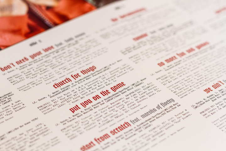
The typography treatment is fairly straight-forward across the whole package. A version of Old English is used for the song titles and a typewriter typeface is used for the liner notes. The use of Old English is significant because of the role it plays in a lot of these rappers lives. Once again, Game shows his intelligence with lyrics on his next album (Doctor’s Advocate) by penning the song Ol’ English. The use of the typeface is important because it provides a real link to things that the fans of his would see on a regular basis. “Got your name tatted in Old English” is a lyric that he wrote for that song. When a friend or family member would die, a common way to remember them is to get their name tattooed in the Old English font as a memorial. Why Old English? I have no clue but it does happen and the use of this font in the packaging is a brilliant move. It has the raw, emotional feel of the “hood” and most definitely relates back to the market that he’s targeting. The use of a dirty typewriter font only furthers that raw feeling that the ghetto often invokes.

The back of the jacket follows the same color scheme and type treatment as the rest of the album. More Old English typeface, more red and black colors. It’s very bold, very striking and also messed up. The tracklisting on the jacket is not the order of the songs on the records. Not a big deal really but when I did notice it I found it rather odd. It’s not completely out of whack, it’s just on one side of the record. Strange. Not sure why it’s listed as one way but the tracks appear in a different format but whatever. It doesn’t affect the tunes and so it doesn’t affect me.

The actual vinyl record is probably my favorite part about this whole album. The A-side of each record has the typical logo, album title and liner notes on it. Nothing special but at least it’s done well. The B-side is where it the vinyl record label really shines.


The B-side features an image of a rim! Completely awesome graphic and just so brilliant in my eyes. The lowrider is so ingrained into the “hood” lifestyle and to have the vinyl label be the 100-spoke rim is just amazing. Maybe the only thing that could have been cooler is if it was gold-colored as if it was from the front of the jacket. I tried to get that second photo above to show it in motion, but it really doesn’t do the label any justice. It’s just such a cool idea. I honestly wish I could have thought of something like that. Simple but VERY memorable.
Summary:
I really like the music on this record and the package doesn’t disappoint either. The white background with well-done photography is great and the typography, while nothing special, is set nicely and it brings it all together very well. The red color pops up in multiple places and undoubtedly has more meaning than just being a bitchin’ color choice. The vinyl label is just a fantastic idea that was executed so nicely. Overall this is a quality record with some real nice design.

Love the rims on the actual record!